Words tell stories of course, but they help paint pictures too. In the case of good package design, words can be as evocative as images. The combination is most powerful when working together to convey a consistent, engaging and rounded story.
‘Writing for brands’ is now a firmly established category in the best creative awards, but it strikes me that so few brands do indeed use the visual and verbal combination to it’s maximum.
Be it tagline use, or simply restating the brand’s RTB (reasons to believe), there seems to be a dearth of brands utilising this powerful combo. If you’ve got something to say, put it on your pack, or lock it up with your logo at least.
Advertising agencies have traditionally owned the domain of tagline development, but with the rise and rise of small, entrepreneurial food and drink brands, or even larger brands lacking the resources to go ‘above the line’, it can, and should in my opinion, fall to their branding and packaging agency to sort this out.
The pack on shelf, (or on-line pack shot) is the brand’s best and most effective advert, so we must use it well to sell – be it an FMCG, luxury or artisan brand, I don’t distinguish as they must all fight for our attention.
At Family (and friends), we have, as you probably already guessed, something of a passion to round this subject and forms a central part our work. Every client assignment starts, naturally enough with careful planning, but also with a deep dive into brand personality and tone of voice. From this we often devise key on-pack messaging to drive brand understanding and benefits.
I’ve featured some of our recent examples, along with others I’ve seen that I think work words and pictures hard. I do love a good tagline…
Agency: Robot. Client: Hain Daniels Rice Pudding
I like the name a lot, but the clincher for me here is the ‘…not as you know it’ line. It really begs some appraisal and would certainly get me picking the product off the shelf for close inspection.
Agency: etiquette. Client: Švyturys – Utenos Alus, UAB
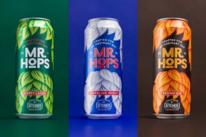
Despite being sold in Lithuania, English seems to be the language of choice for this chirpy craft beer range. I love the line ‘crafted for an ordinary day’. It tells me that time and energy has been taken to brew, but that it’s not a precious or beardy offering.
Agency: HubGroup. Client: Yousli

This Australian Muesli, offering bespoke breakfasts, really nails it with the glorious line ‘Make your Day’. Whilst it’s not an in-store retail brand as far as I can tell, the sense that you are in control of the most important meal of the day is loud and clear. The neat addition to the pack weight also creates personality without being cheesy. ‘Wish I’d done that one…
And here are some of our own favourites:
Geobar. ‘Change the world, one bite at a time’.
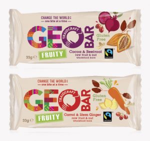
Traidcraft’s flagship retail brand, Geobar is the UK’s only proper fair trade cereal snack bar. Our aim was to help put consumers right at the heart of the deal, helping them connect with the positive impact that buying creates.
Monty’s Bakehouse. ‘Travel with Taste’.
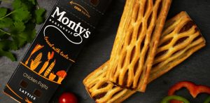
Monty’s offer some of the world’s finest in-flight snacks, with ingredients sourced from around the globe. Prior to the rebrand, the packs carried the line ‘hot posh snacks’, which most non-English speaking consumers failed to understand, or consider to indeed be ‘posh’ in truth.
The brandline connects directly with the logo and with the brand’s overarching idea.
Allinson Flour. ‘Making you a Better Baker’.
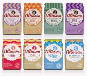
It’s a big claim for a bag of flour, but Allinson has the history and the passion to help grow it’s customers culinary and baking skills; through great quality ingredients and support through recipes, tips and front of pack quick useage guides. No other flour brand engages like Allinson, and the sales results prove it.
Zaytoun. ‘Rooted in Time and Tradition’.
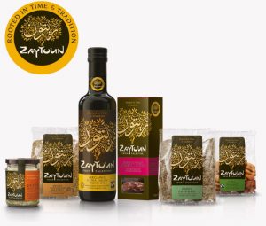
This amazing LLC helps maintain the livelihoods of Palestinian farmers in the face of conflict, but it’s not a story that sits well with foodie consumers looking for artisanal produce in Wholefoods or Harrods necessarily. The newly developed brand position around ‘ancient food wisdom’ gave us the opportunity, through a new tagline, to extoll the virtues of the products and emphasise the importance of preserving a way of life in a troubled region.
Varo. ‘Come Home to Nigeria. Come Home to Varo’.
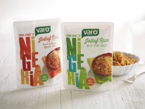
Lastly, we have helped Varo foods credibly position themselves as ‘Africa’s Food Ambassador’, bringing the taste and spreading the word for easy West African in-home party cuisine. Again, the message doesn’t dominate, but helps create an on-pack narrative.