Celebrating their 20th year, The FAB Awards – (The International Food and Beverage Creative and Effectiveness Awards), announced the addition of The FAB Choice Award to its recognition program. Similar to a people’s-choice award, the award, inspired by Family (and friends) was voted on by the public.
As an exploration into what makes for ShelfHappy® packaging, we at Family (and friends) wanted to harness insights from everyday people to uncover which pack designs they intuitively love.
The idea.
The FAB awards are always meticulously judged by real industry experts with carefully-measured views.
As a logical extension of the judging, we thought it might be exciting to mirror the process by allowing the design experts to judge the best of entries, but then ask potential consumers what they loved the most, too.
This was not trying to be the X Factor where talent-spotting is put in the hands of the audience, rather it acts to ‘seal the deal’ on what is already considered truly fabulous.
To conduct the study, F&f teamed up with The FAB Awards and two renowned research agencies; Link Consumer and Mindlab, to develop a bespoke process which now gives us the first ever FAB Choice Award.
What we did.
A representative (and therefore diverse) base of 1000 people from the UK took part in an online study. Not just a simple survey, but a test that has been designed by psychologists with the intent of uncovering what the public actually feel (not think) about packaging design.
These 1000 effectively became “lay-judges” for the 21 Silver or Gold FAB design winners.
How we did it.
Ahead of the online study, qualitative research uncovered 4 factors which matter the most: those being Striking, Imaginative, Irresistible and Ground-breaking.
Our respondents took part in a series of intuitive tasks specifically designed to get right to the heart of how a design can evoke these attributes. We didn’t allow respondents to ponder the ‘Irresistibility’ of a design – they had to feel it instantly!
To add richness of understanding we also asked them ‘why’ they loved their preferred design. Then with a light dose of mathematical wizardry, the research team determined the overall winner!
About the top ten.
What we found incredibly exciting was that the most loved packs were not necessarily the most well-known, or often purchased by the respondents, proving that the power of design can instantly create attraction and desire.
With nearly all winners, the feedback was that the packaging in some way, made them feel happy, or prompted the use of ‘love’ to describe. It’s what we intuitively thought might be the case, but borne out through the people.
Some of the key triggers were very current and personal; connections with elements of the pack story or visuals that resonated with their own lives, such as the rise in interest in body art, or LBGT rights.
The winner.
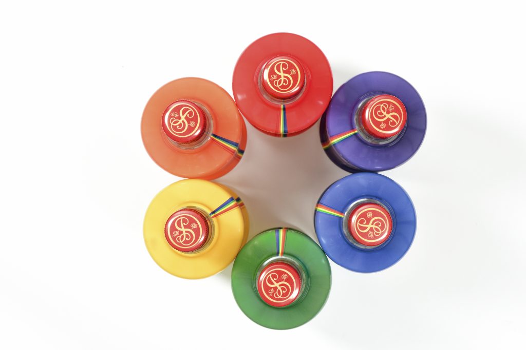
Serendipitously, the winner of this year’s FAB People’s Choice was Smirnoff’s ‘Choose Love’. The Smirnoff Choose Love 2017 limited edition bottles were made available to buy exclusively in Tesco stores around the UK, replacing the regular Smirnoff 21 design during the Pride season.
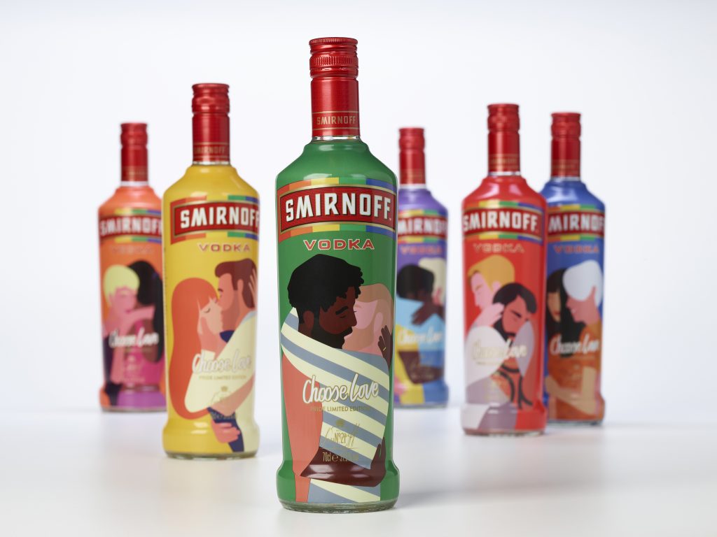
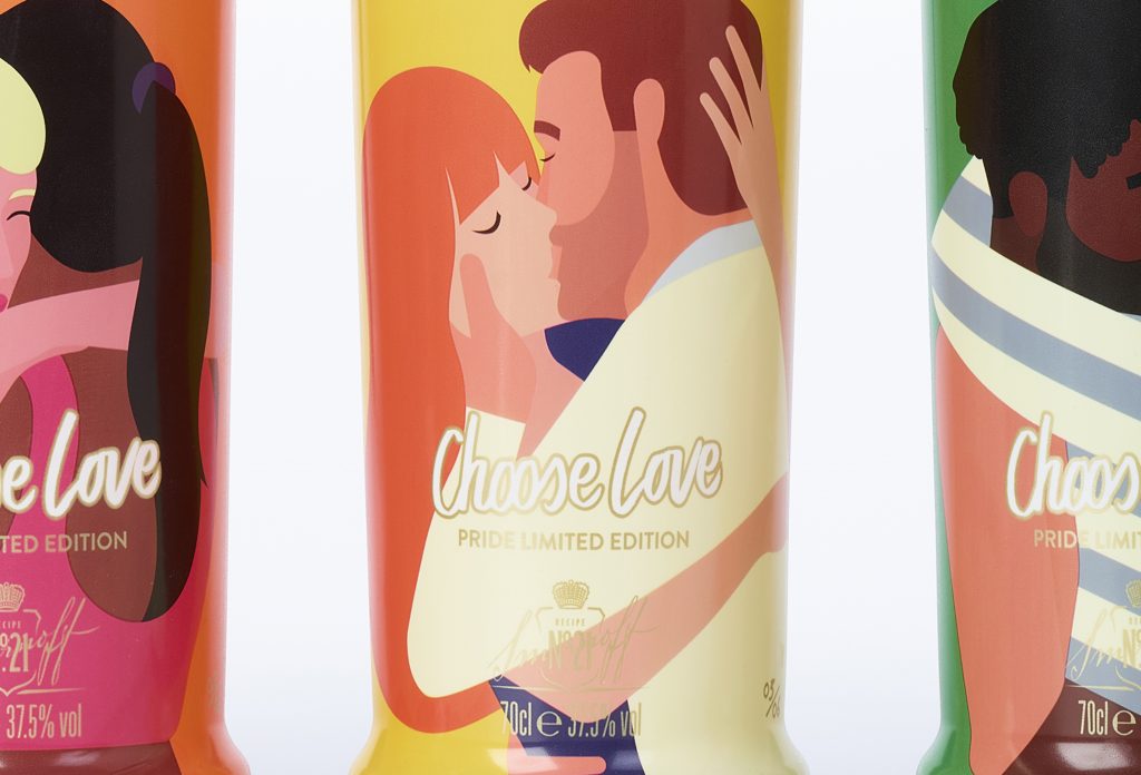
The couples on pack “have been carefully crafted to represent national diversity and inclusivity – an idea that is central to the Smirnoff brand – and there are hidden details, such as tattoos and jewellery, to discover on each bottle”, according to Design Bridge, the designers of the packaging campaign, which features the artwork of Rob Bailey; after deciding upon a series of 6 bottles – one in each colour of the Pride flag – Rob created sets of embracing couples to adorn each of the bottles.
The design represents some of the key characteristics we look for in ShelfHappy® packaging, strongest in this case:
-
Human and cultural truths working together to produce an idea that resonates with genuine brand aspirations.
-
A clear big idea visible at point of purchase
-
Strong sense of personality
-
Visual assets which give unique impact
What people said of the winner.
Spontaneously, responses from The People were as such…
“The colours are bold and eye-catching so it stands out on the shelf. I remember this was promoting LGBTQ so it has a good message behind the design too”
“The colours are nice and bright, the designs are cool and they stand out. These are something I would keep and put on display even after finishing the product”
“It’s bright and colourful, plus it’s promoting LGBTQ+ which is something I’m very passionate about”
“It is colourful and looks personalised to individuals. It’s a ‘loving’ design that appeals and makes me feel happy”
” …imagery is the most appealing, it would really stand out in the store and home”
“Funky, modern, bright, once seen never forgotten”
“The graphics are amazing, bottles are like a work of art”
The Top Ten
The rest of the top ten winners (in no particular order) are featured below, with some soundbites.
Archie Rose X Horisumi Gin Squad Ink, Australia
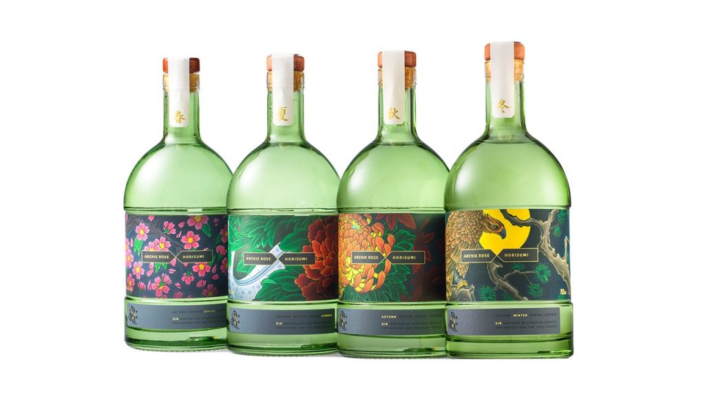
“I have traditional Chinese tattoos, and this reminds me so much of this. The bottle would make a good display piece”
Tanqueray Flor de Sevilla Design Bridge, London
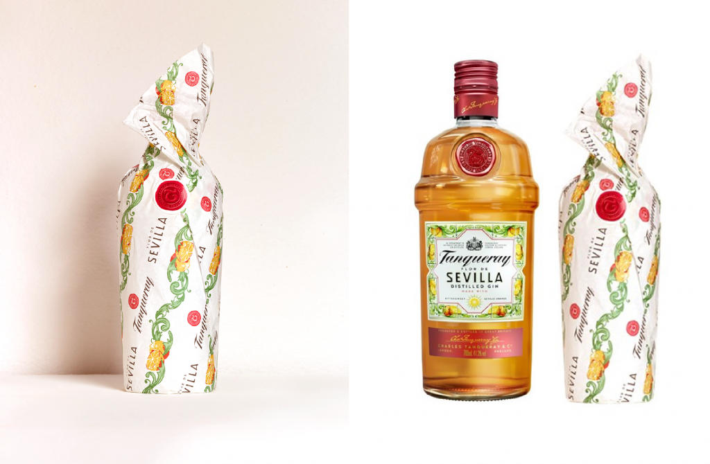
“It’s bright and bold, it tells you something about the product instantly and it makes me happy”
Courvoisier Limited Edition Studio Minerva, London
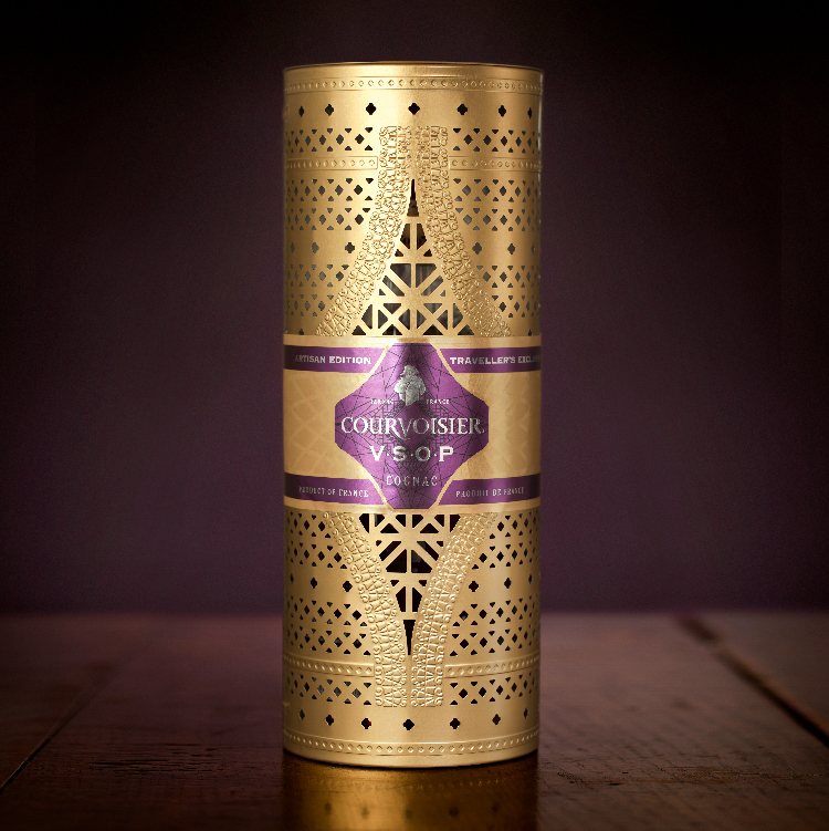
“Looks a timeless yet modern design, love the colours especially purple and gold. An understated yet luxurious looking product”
Charbonnel et Walker Christmas Collection Together Design, London
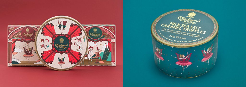
“It’s really festive, the design is beautiful and evokes really lovely memories. I think this is perfect for the Christmas period”
Fortnum & Mason Florentines Design Bridge, London
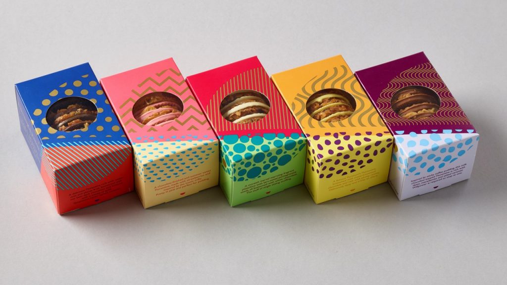
“I love the colours and the tiny little box makes it a personal little gift. I really like it”
Burger King Holiday Turner Duckworth, UK & USA
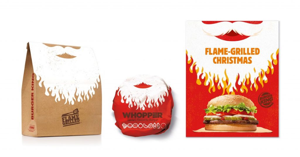
“Really nails home the ‘flame’ grilled aspect and its red and white that denotes Christmas”
The Beautea Supperstudio, Spain
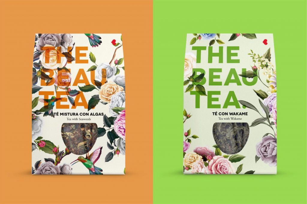 “The packaging is really decorative. It would look good as a notebook design or as a design on a purse, bag, bedding etc. The flowers are very pretty and I like the colours. It would be a shame to throw this packaging away”
GREK Tea Interabang, London
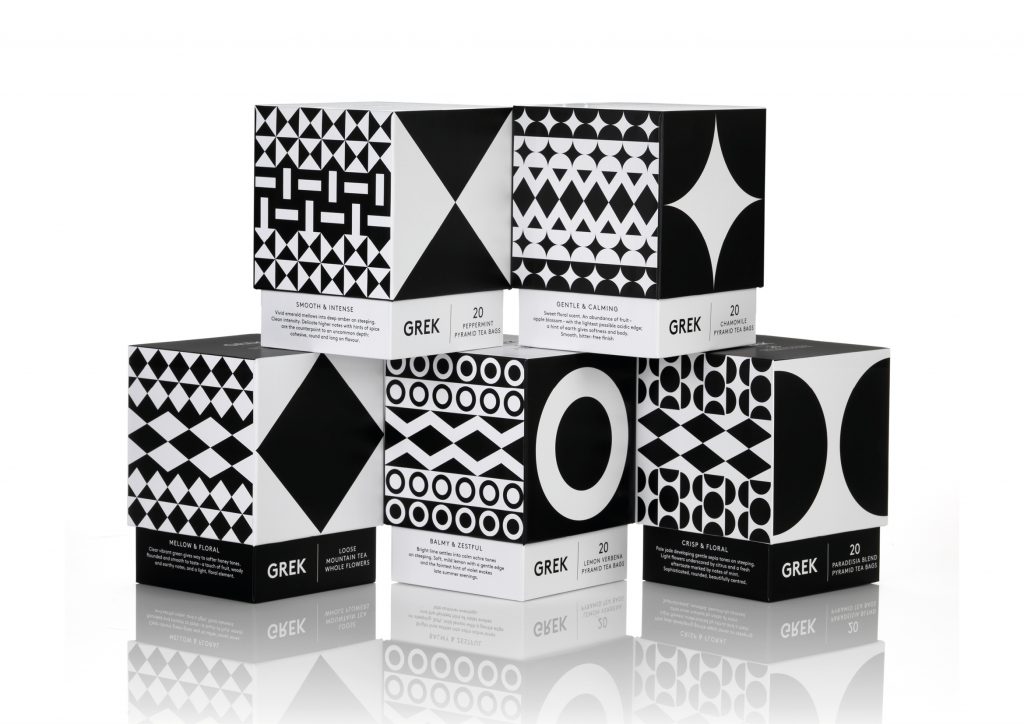
“It’s optically interesting, something you could spend some time looking at and contemplating”
“It is minimalist and calming”