For a fair few years now, we’ve been brewing our relationship with Cafédirect, helping them expand their growing portfolio. This time around we were tasked with helping shape up a new ‘big idea’ for the speciality coffee brand Grumpy Mule.
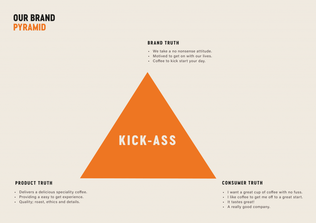
The new brand positioning focuses on Kick-Ass quality, rather than belligerence!
This post gives a bit more background to the Grumpy Mule’s development in recent months, how we’ve shaped the brand’s messaging, tone of voice and visual identity for its next phase of success.
Grumpy Mule is 100% Fairtrade, largely organic, and the packaging is now fully recyclable. Cafédirect Group has always led the way in putting farmers first, and Grumpy Mule is leading the way, making sure the coffee’s good for the world as well as our taste buds!
The 200g bags are currently available now at Waitrose and Ocado, with new look to hit next month (October 2024), with plans to roll out to even more shelves soon. The brand is also gaining ground in universities, cafés, hotels and offices across the UK.
A brand that is happy on the physical shelf, online and in the buyer’s mind requires careful planning. Using our ShelfHappy® principles, we tackle each assignment with a rigorous approach:
- Identify market insights
- Write a unique proposition
- Create personality driven visual and verbal assets
- Extend across the brand world with clarity and consistency
It’s not rocket science, but many businesses fail to observe these very simple stages that are key to good brand management. Grumpy Mule is no exception to these rules and we made sure we kept them in mind when revitalising the brand.
Finding our space.
Reading the market, many specialty coffee brands like to position themselves as somewhat ‘aloof’, creating slightly unnecessary mystique commonly seen in winemaking.
But for people just looking for a great cup of coffee, they tend to make it way too complicated to access. This gave us the space to help set Grumpy Mule apart – through the idea that specialty coffee should be ‘easy to get’ for everyone, not just the so-called experts.
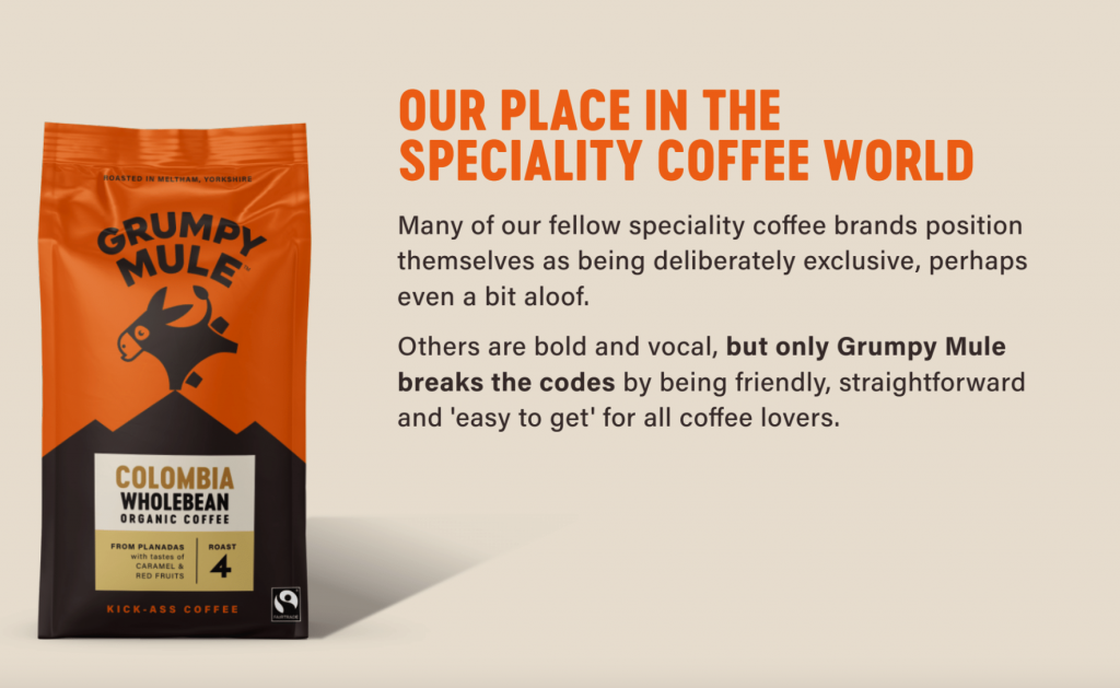
The first step we took was to make sure that the new proposition would really home in on the idea of taking a ‘no nonsense’ approach – how we act, how we talk about coffee. Keep it super simple.
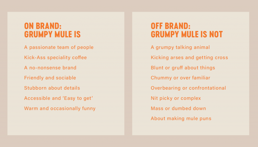
Grumpy by name, not by nature
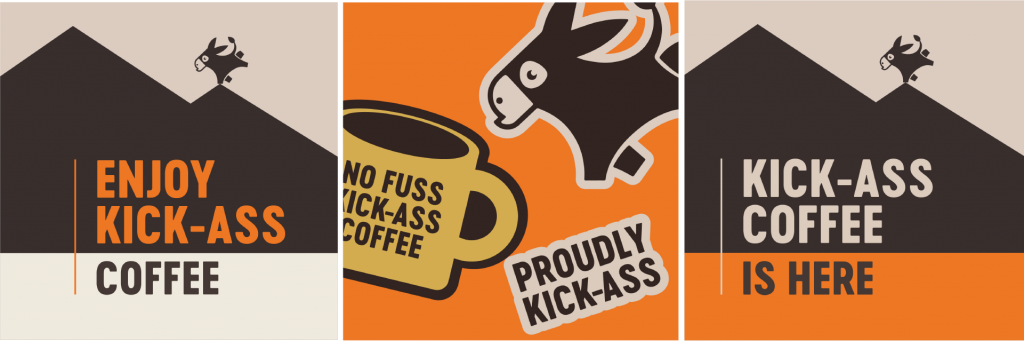
The newly developed ‘Kick-Ass coffee’ brand-line conveys a positive attitude without any unnecessarily negative vibes. As our key brand asset, the mule was well loved, but we didn’t want it to be seen as a brand character with a bad attitude. We didn’t want to be seen as grumpy, despite the category disrupting name.
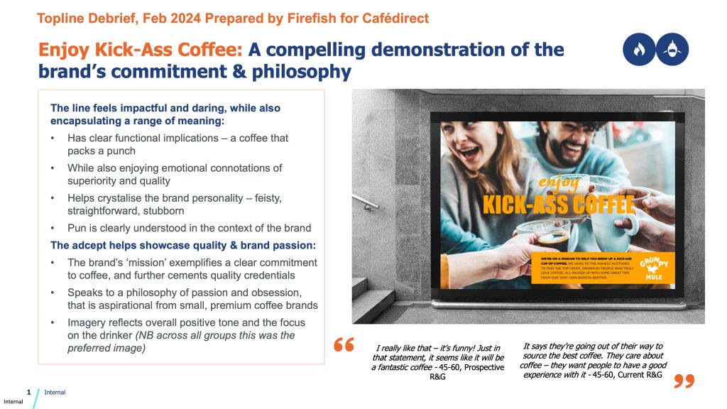
“Kick-Ass’ has allowed us to bring in a bit of friendly wit without going too far into the mule puns. At the end of the day, Grumpy Mule is a specialty coffee, so overusing jokes wouldn’t be effective in reassuring consumers they are getting the best quality coffee”.
Lorraine Kelleher, Marketing controller, Cafédirect.
That said, we’ll allow the boss little ‘mule humour’ indulgence in this aspect.
“At Grumpy Mule, we’re not just making coffee – we’re making sure every cup is stubbornly perfect,”
Says John Steel, CEO of Cafédirect Group
Setting out a prescriptive tone of voice plays an important role in conveying your brand personality, often full of subtleties, but the wrong language and radically alter the meaning and the message.
Less being more
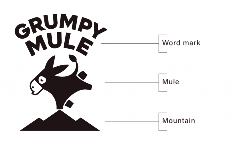
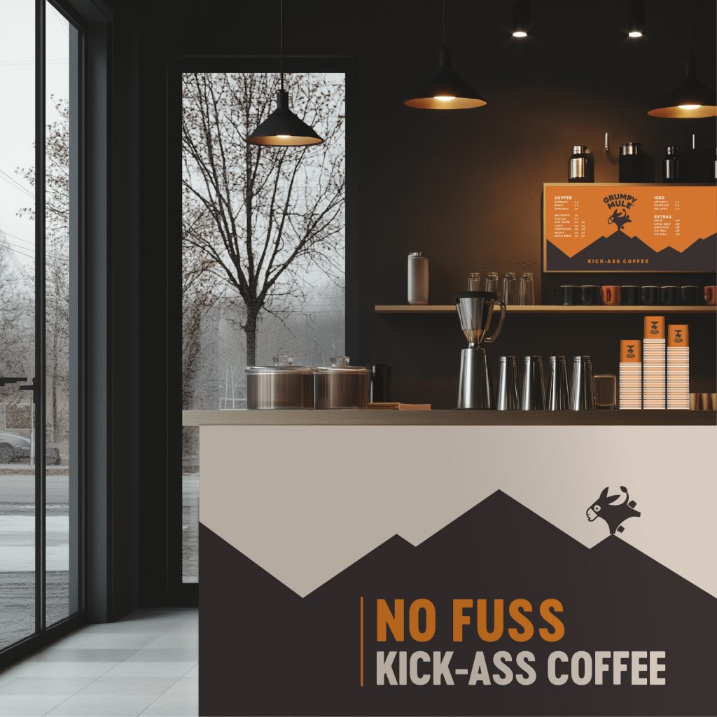
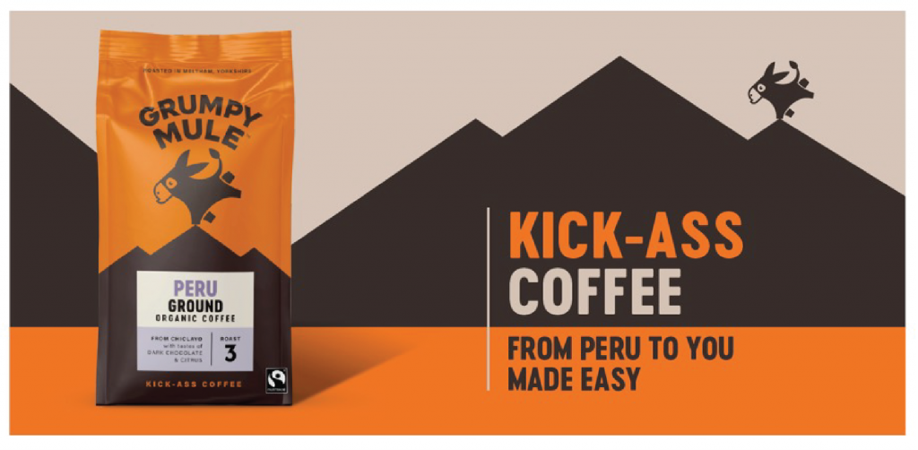
Visually, instead of having the mule kicking its own brand name about, a bolder and more ‘iconic’ creature is now proudly positioned on the highest peak (where the best coffees come from)
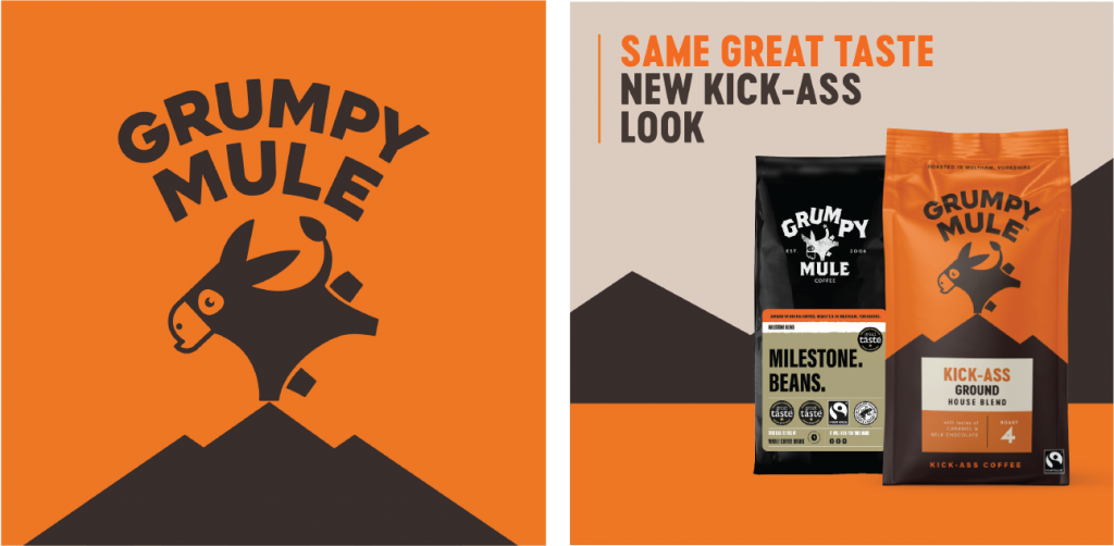
The mule is now more social, and more relatable but deliberately does not have a name in order to avoid cartoonification.
To further build friendliness and connectivity, the previously heavy black packaging has been replaced with a bright signature orange and a warmer coffee-coloured dark brown shade.
Shop-ability
Another mistake that can happen with pack design layout is a lack of simplicity, making brands just that bit harder to shop. 3 rules apply in our opinion:
– Brand first
– ‘My’ variety
– Key benefit(s)
The rest is largely unread until it’s in the home whilst enjoying the food or beverage. And that’s fine.
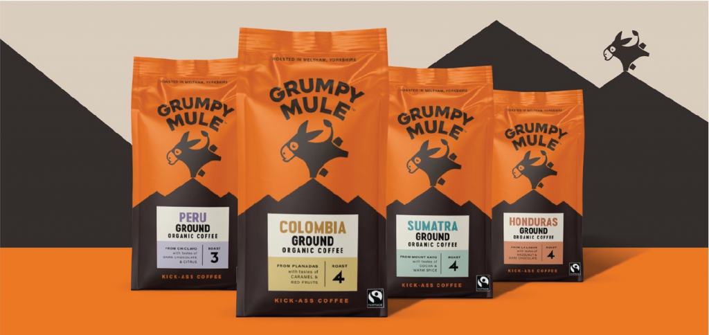
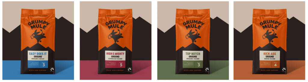
So our new packs have the icon front and centre, proud and upfront, with a much simpler hierarchy of information helping the buyer more readily know what they are getting when they pick up the pack.
This included developing some new naming conventions for the blends, with ‘KICK-ASS’ blend also becoming the house blend identifier, with other colloquial names adding to the brand’s warmth and familiarity.
Next steps will be a roll out of a new off pack look and feel across food service sites, social media and shopping channels.