This article is about brand proposition and bringing about brand personality through naming.
One of the great creative joys in branding is to name stuff. Like the birth of a child, part of the fun is choosing the ‘right’ name for that offspring.
You can argue, as many do, that a name simply takes on meaning as the personality of the owner takes shape, and maybe adapts as they do too. George becomes ‘Geo’, Jack Becomes ‘Jay’, Xavier becomes a Havi maybe, Alexandra becomes an Alex…
Leadership vs. ownership.
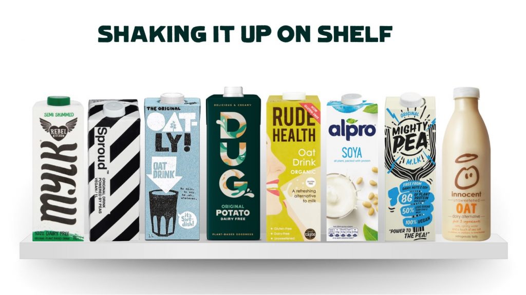
In branding however, great names don’t adapt to their environment, the names shape that environment. Apple gave ground for Apricot, Blackberry and a variety of technological fruity names to flourish. Red Bull spawned Red Thunder, Red Ball, Red Blue, Red Goats, Gold Cow, Cambodia Bull and a lot of other bullocks.
These household names become as such, often because other brands and products want to be seen in the same vein – and to cash in on the familiarity and personality that surrounds them.
A great name builds a category and consumer recall. It has familiarity and imbues meaning, whether overt or oblique – but should capture an essence of the brand’s spirit in our opinion.
Personality and proposition
Apple Inc. perhaps alludes to Job’s visit to a commune by the name of ‘the apple farm’, or more possibly Newton’s revelation, or maybe Eve’s. Could it be an homage to Alan Turing, who committed suicide by eating a cyanide-laced apple. Unclear, but we are tantalised by both ambiguity and personal interpretations. Its name ‘personality’ is intelligent, enigmatic and above all, creative.
Not so for the taurine fuelled beverage – a brand that bears its power and prowess through its overtly Taurean moniker. Red Bull does what it says on the tin; bold, energised and no-nonsense.
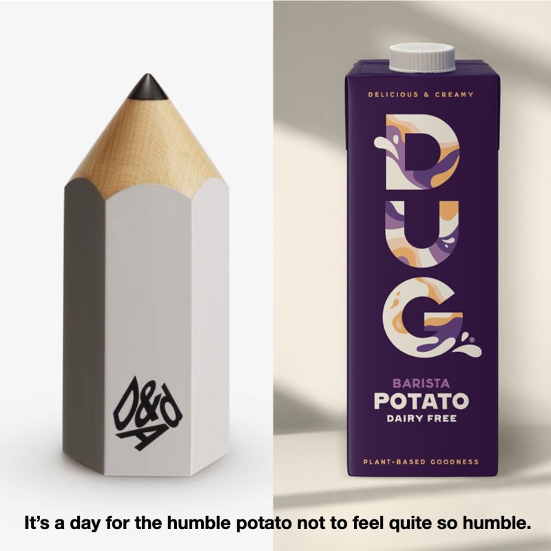
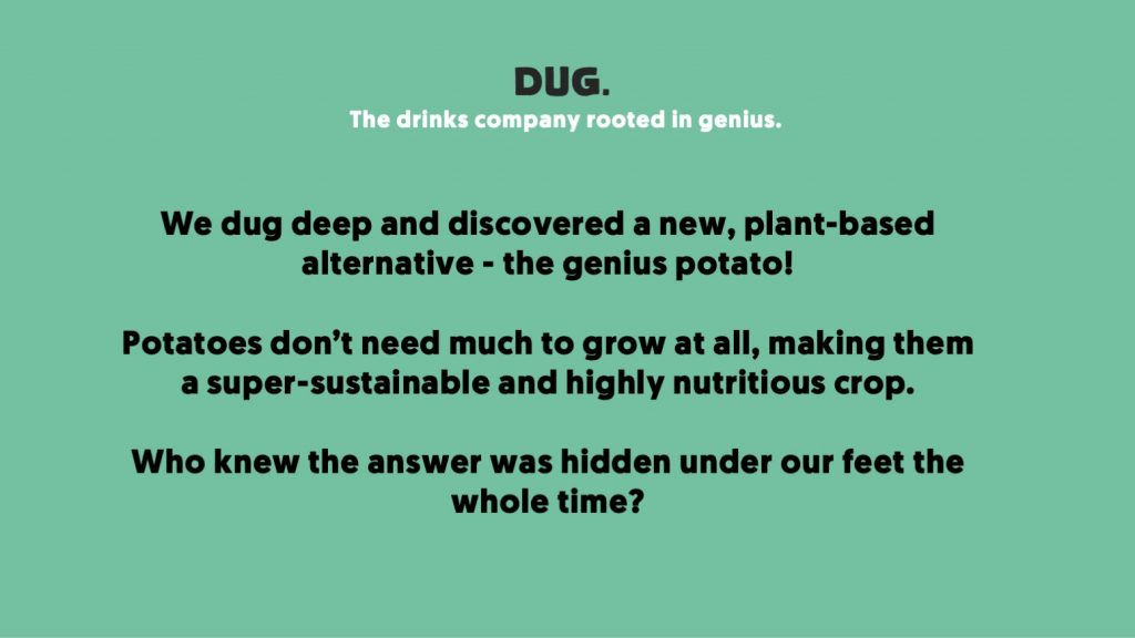
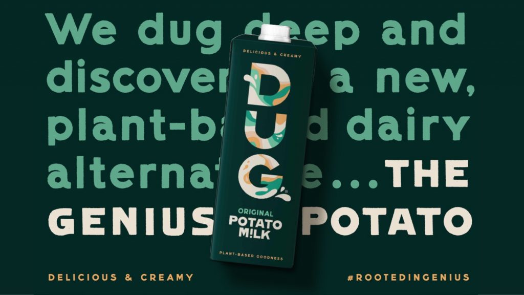
DUG® (the ultra sustainable potato-based milk alternative) recently picked up a Graphite D&AD pencil for writing crafts. Although on the face of it, the ‘smile in the mind’ seems obvious, our journey to DUG wasn’t a straight path, rather a journey around a few propositions that we explored with consumers to find the right story and personality.
We looked to research to help us, working with Link Consumer [www.linkconsumer.co.uk] to trial brand and product together.
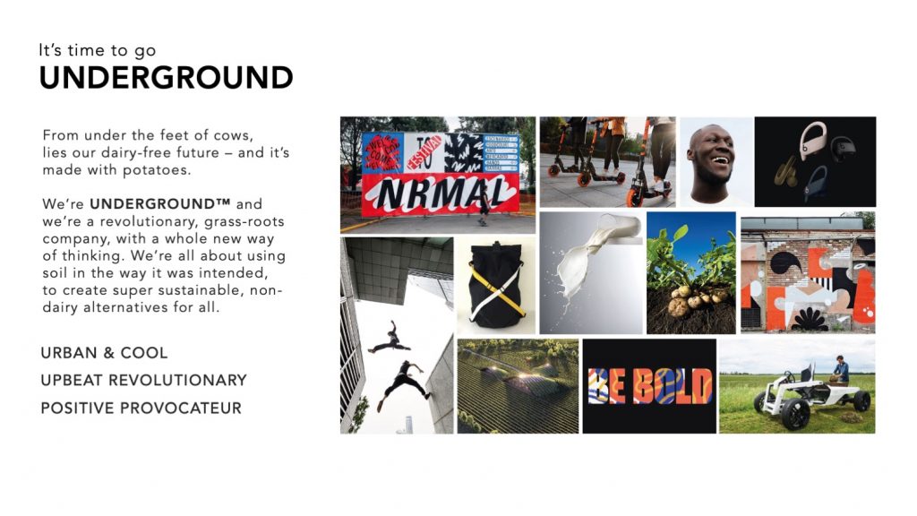
Underground Drinks – was more subversive, more urban and provocative.
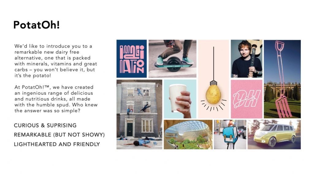
PotatOh! – was more about curiosity, surprise and light heartedness.
Consumers voted in spades that Underground Drinks was more fitting to the brand DNA, the combination of consonants and vowels was quite grippy, but that PotatOh! was a cute idea. So some more scripting was required…
After a day or so in the naming den, DUG® was born. Too short, too much of a pun? In the end, chosen as a daringly tight encapsulation of the brand.
Taking advantage of disadvantages.
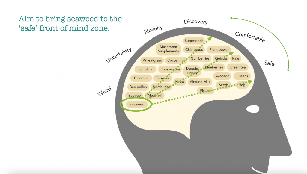
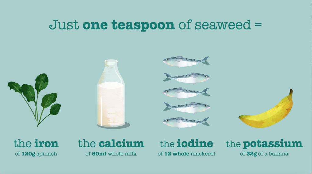
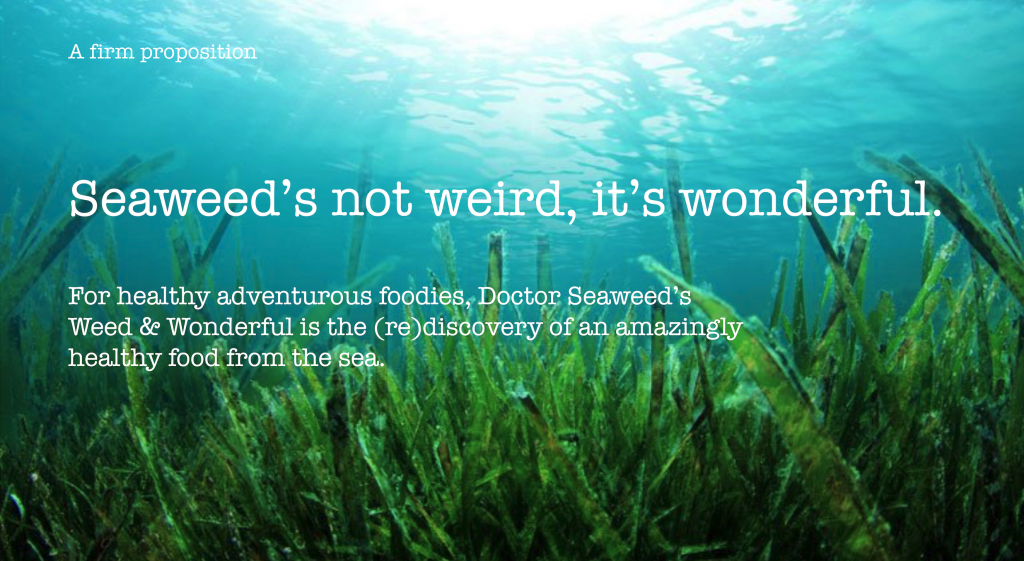
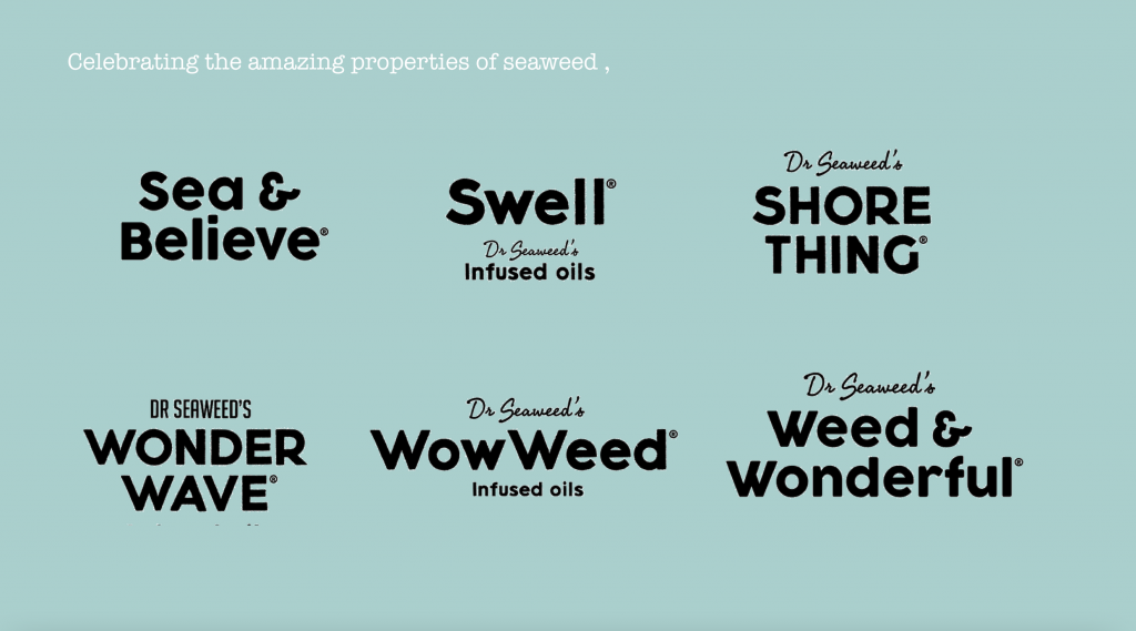
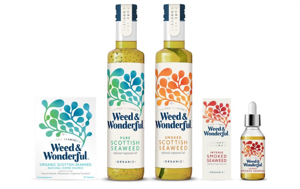
In contrast, our naming work for Dr. Seaweed’s® product vision was built on a wave of deep consumer understanding in a different way. A range of products so beneficial to health; high in iodine, promoting thyroid health, metabolic and cognitive function, skin and nervous system and more… yet, seaweed was still seen as a weird and unknown quantity in the minds of the general public.
Our proposition defined the brand as “Not weird, but Wonderful” and after just a couple of rounds of tight thinking, the perfect storm was arrived at in Weed&Wonderful®. And won UK Packaging Branding Project of the Year 2018
Feature image Jill Sauve @unsplash