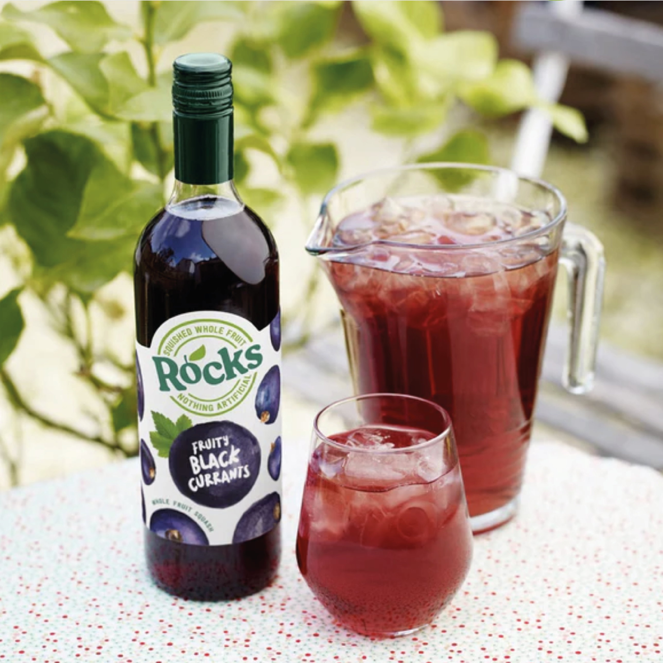
Rocks, the leading premium squash and cordial in the UK, wanted to rejuvenate their visual and brand identity to express their unique proposition of using only squished whole fruit, water and nothing else.
We identified our target consumer as affluent parents who are seeking a healthy, busy and active lifestyle. Although they’re conscious on their children’s health and are environmentally conscious, they love having time to relax and indulge themselves with treats from time to time.
F&f developed “refreshingly liberating”, a big idea covering functional and symbolic benefits of Rocks- you feel ‘liberated’ with the knowledge that you’re doing your bit for your child’s health, your health, and for the environment.
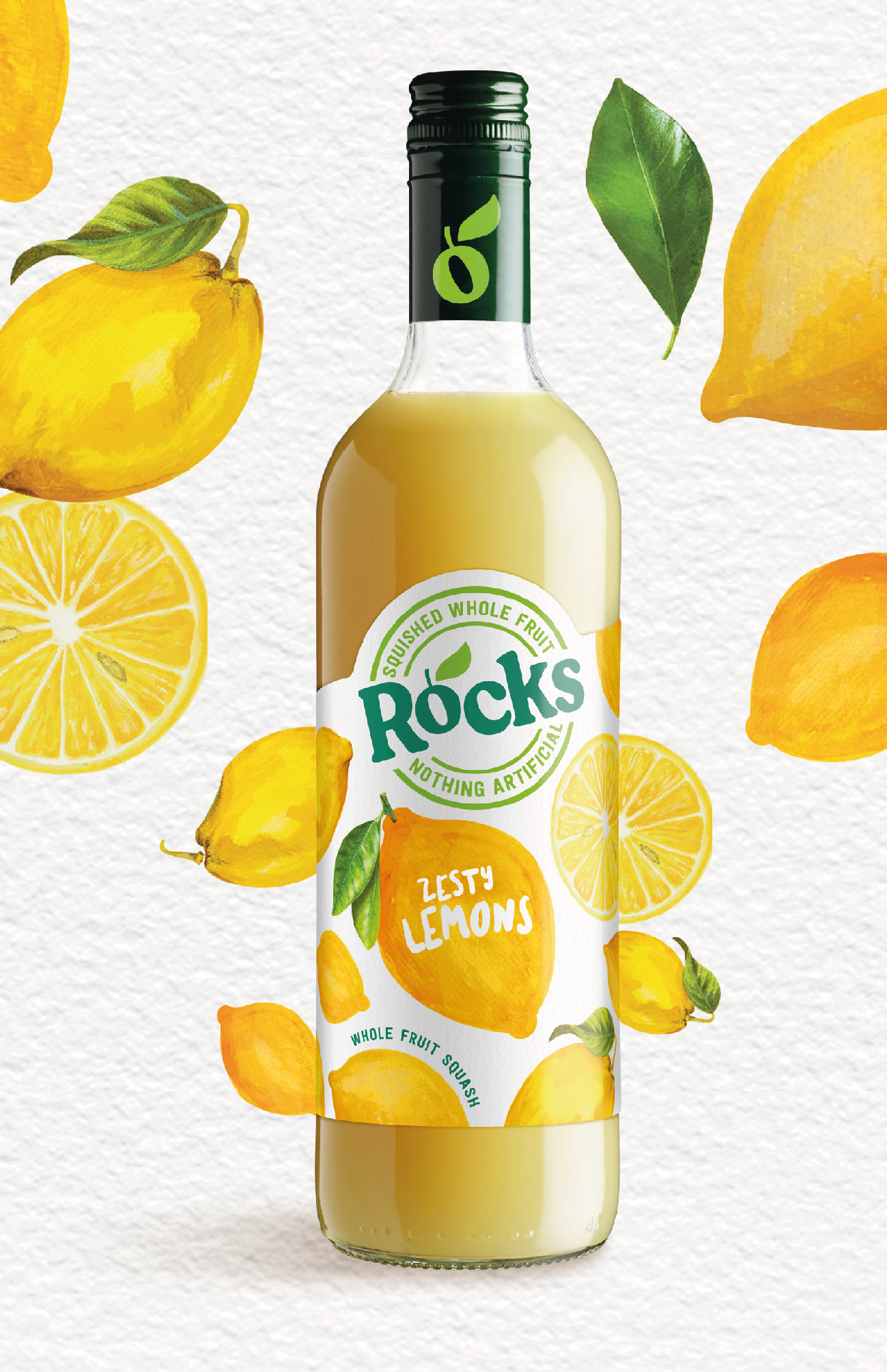
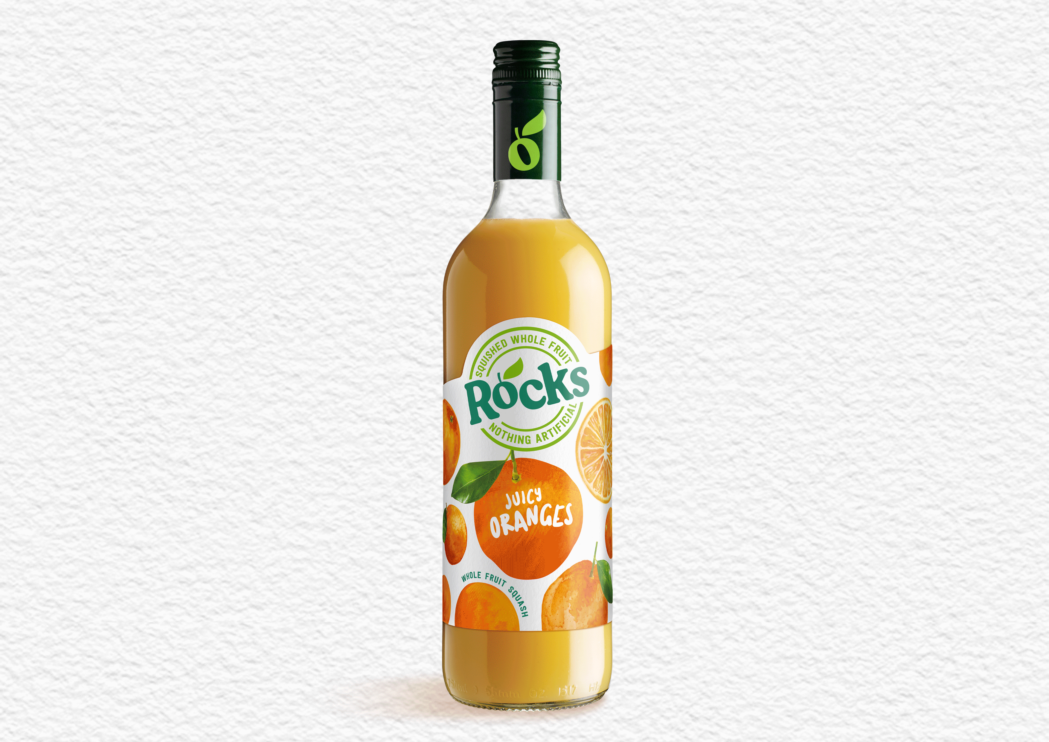
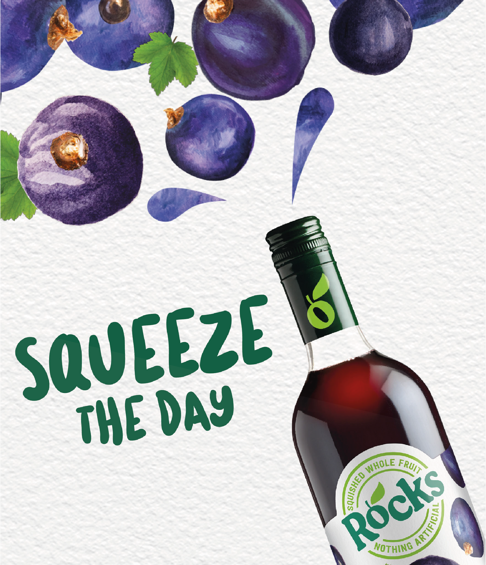
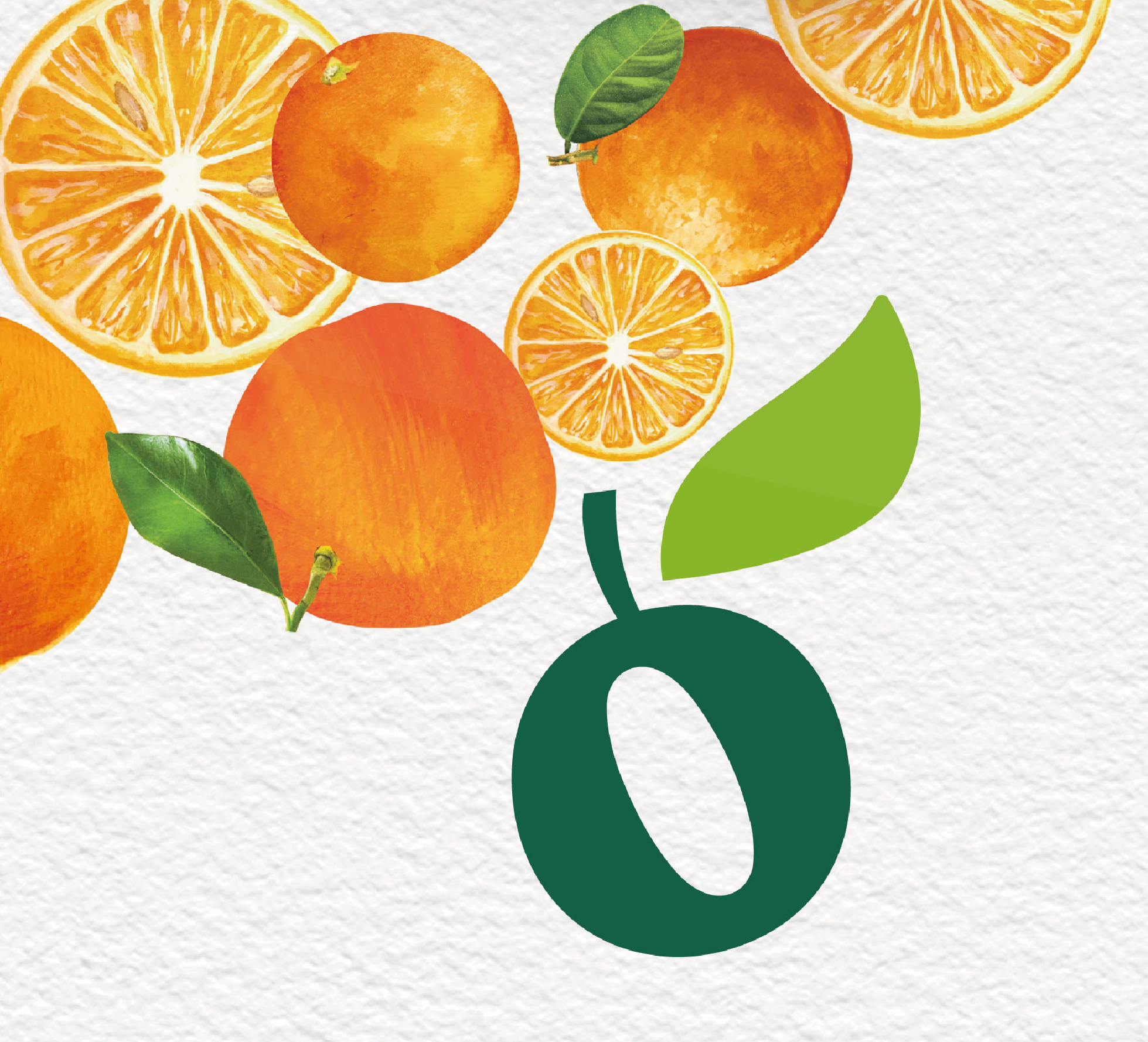
A refreshing visual identity combines shades of green and white with bursts of colourful fruit illustrations for freshness and premium cues, also reiterating their credo “only whole fruit and nothing else”. A simple, summery look fitting for the UK’s leading premium cordial.
“We wanted our packaging to reflect our use of whole fruits and no artificial flavours- and provide that strong, natural reassurance, so we’ve brought all the fruits front and centre of pack and cleaned up the design to make it look simple and delicious.”